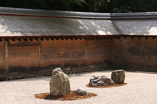
The Zen garden at the Ryoan-ji in Kyoto, Japan. Photo Thomas Guignard
This Japanese structure is very simple, yet very elegent in its simplicity. Even without the details of windows and doors, there is a warmth to the building. The earth plaster walls have aged to a watercolor-like patina. The patterns come from mud that was mixed with rapeseed oil (a vegetable oil more commonly known as canola oil). Materials such as this are in beautiful contrast to the monolithic look of stucco or paint in that they create harmonious variations in color and texture.
The design principles used in this structure can be incorporated into home design. They are not hard rules, but something that can be drawn upon to add visual interest. By being able to evaluate what works and what does not work in a particular design, it will be easier to make the changes that are required to fix the problem. The owner/builder should be very involved in the structure’s design, instead of just turning it over to a “professional”. This goes for both green building design principles (for overall energy efficiency) and the aesthetic design. Being aware in all of the various design options is what I call ‘building with awareness” (hence the title of my book and DVD).
For simplicity, I will break the visual design of of a building into two parts. First, there is the overall physical form which is the shape of the building. The second part would be the color, texture, and surface treatments within the major shapes. An analogy would be the overall shape of a tree that is enhanced with the color and texture of the bark and leaves.
The mass production of various building materials such as cement stucco, inexpensive aluminum-framed windows, and cement block, has made it too easy to let the materials dictate bland design (see Part 1 of this series). Since these materials tend to have little variation in color and texture, the design of the overall form becomes even more important. By using natural materials, the desire for color and texture will take care of itself. For example, straw bale construction and adobe construction will inheriently add a visual softness to the form. It is about using materials that are appropriate for the task. They should add to both the visual and structual integrity of the design and the materials should be appropriate to the objects’ ultimate use. Whereas I like to see natural materials in their basic state in a home, flying in a jetliner made of bamboo and mud would not boost my confidence in the engineering of the aircraft! That is where I would prefer to see titanium, aluminum, and carbon fibre materials.
In this article, we will stay with the topic of the overall form. It is the transitions from element to element that are the key ingredients. It is the detailing of the transition from the ground to the wall, from the wall to the roof, and from the roof to the sky, that adds visual interest. This is how it was done in the building.
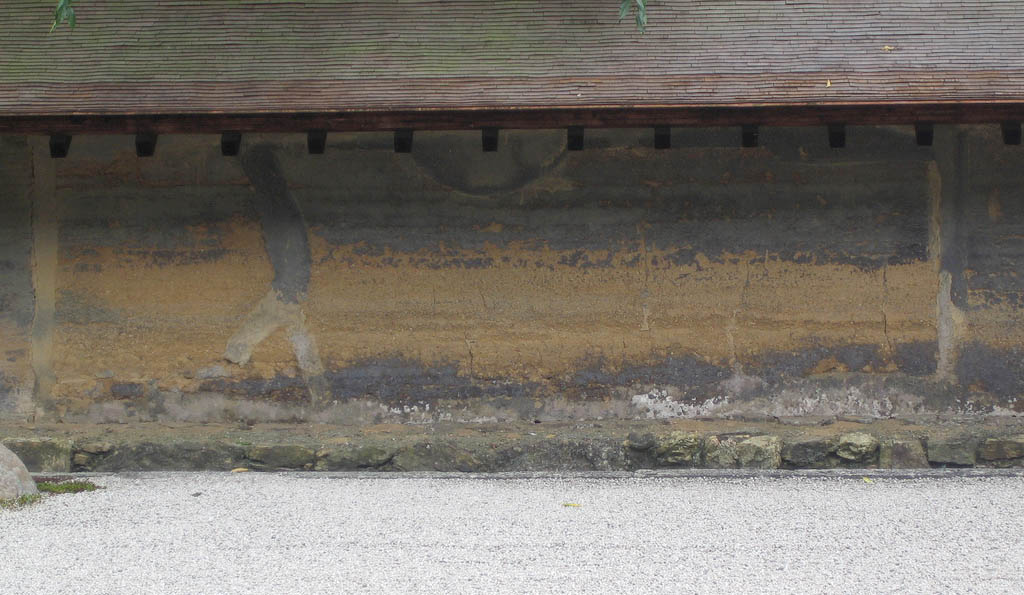
Photo: Dorothy
In the drawing below, I have traced the contours of the building. Even with the color and texture deemphasized, the shapes and forms feel balanced and related. The horizontal ground does not just hit the wall and become a vertical plane. It starts with a foundation of stone that borrows the same forms from the immediate rock garden and the overall environment. The visible foundation becomes a transitional form, linking the earth to the man-made wall,—all built from materials of the earth. This is not only visually pleasing but it also protects the earth plaster wall from rain splashing and moisture being absorbed from the ground. Also note the thin line of cement below the stone. This too acts as a functional and visual transition that adds visual appeal. It is a layering of materials showing a natural progression of the building process. The materials are stacked on one another in a way that is physcially sound and logical.
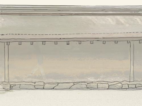
Now look at the transition from the wall to the roof. The visible ends of the roof rafters visually tie the roof to the wall, like vertical stitching. One form is interwoven with the next, thus bringing the two together. The dashed line indicates the roof overhang where there is a color change in the shingles.
The plane of the roof transitions back to a larger flat plane. The roof is capped with horizontal bands that elude to distant mountains. It is not just the wide plane of the roof abuting the wide plane of the sky. There is a transitional element, long and horizontal, that signifies that one form is merging into the next. This ridge cap also mimics the height and feel of the foundation itself, thus further tying the building design together. Also note that the width of the horizontal ribbons of the roof ridge are wider at the top and bottom, just where they transition to the much wider planes of the roof and sky.
These patterns of detail, that contrast with the broader and simpler planes, give the eye areas to focus on. I see an anology to motion picture sound tracks. Sometimes a film will contain wall-to-wall music and your ear becomes numb with the monotony. Films need quiet passages in order to fully appreciate the orchestrated sections. Your eye also needs time to rest so that the details become more evident. It is all about contrast. Without it, one feature does not stand apart from another.
This apparently simple structure incorporates much thought as to how one form relates to the next. It is the attention to detail that makes the structure pleasing to look at. In my opinion, when buildings look like they were designed and built with care, they will last longer since others will want to preserve them. This is why visual design is so important in green building. I will talk more about form in the next “Looking At Design” article.
Article by Ted Owens
These people really amaze me with their simplicity, that they can create such beauty with the littlest of materials, we as westerners should really take a lesson and maybe even follow them,
This is a very interesting blog, something that I haven’t come across before its nice to get someones out look on design in such a personal way.
I have always loved the way Japanese have designed their homes, temples, and other buildings. Both inside and out, and even the way the language looks on paper, the Japanese has a beautiful style.